
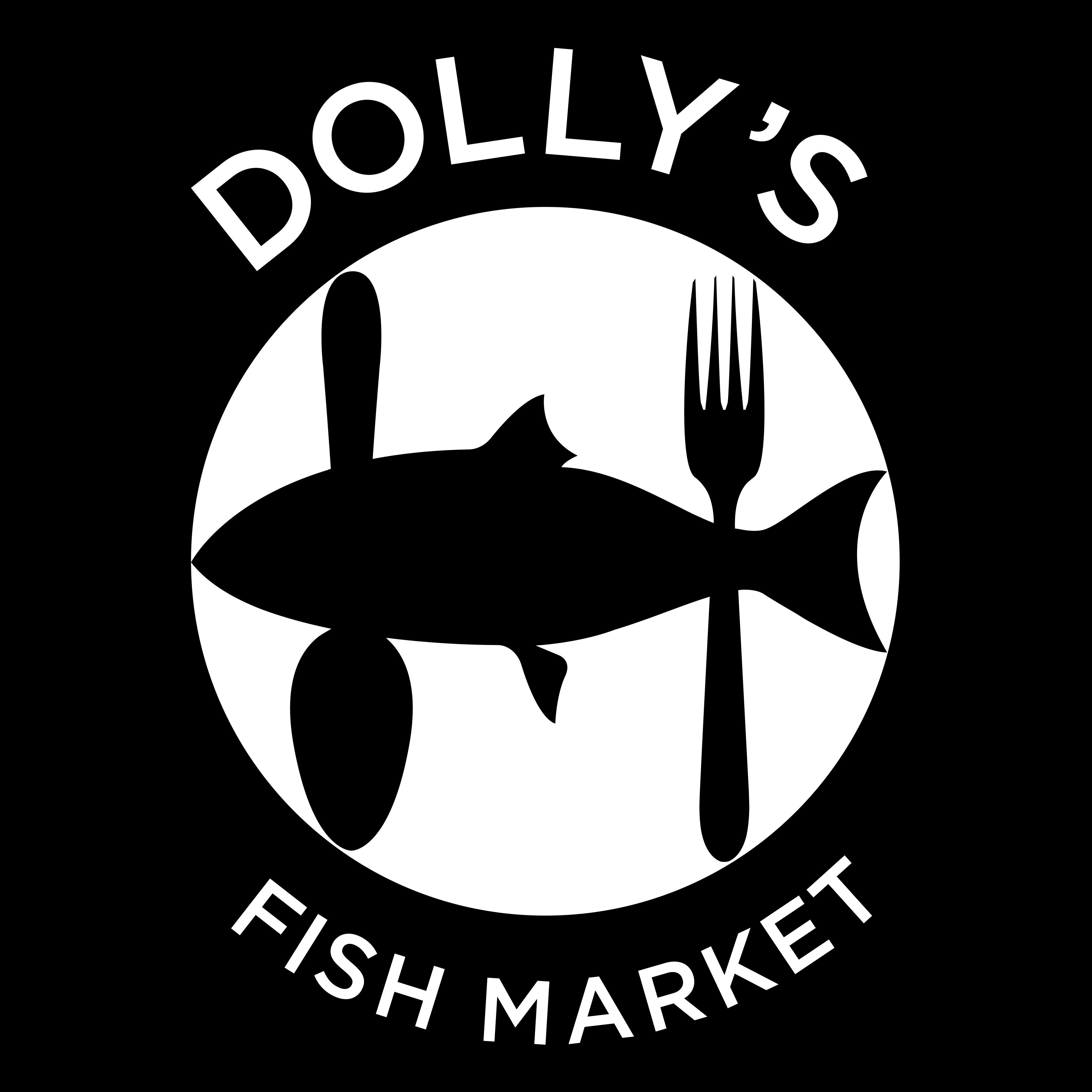
This project was a conceptual rebrand of Dolly’s Fish Market, a long-standing seafood business in Prince Rupert. The goal was to modernize its identity while keeping it rooted in the harbour’s culture and authenticity. The new brand system focuses on bold simplicity, using strong forms and a direct visual language to reflect both the grit of a working fish market and the honesty of its product.
The Dolly’s Fish Market logo was redesigned to better reflect its evolution from a local fish market to a restaurant positioned beside Prince Rupert’s cruise ship dock. The new mark pairs a salmon with a fork and spoon, clearly signaling both fresh seafood and dining, while staying true to Dolly’s coastal heritage.
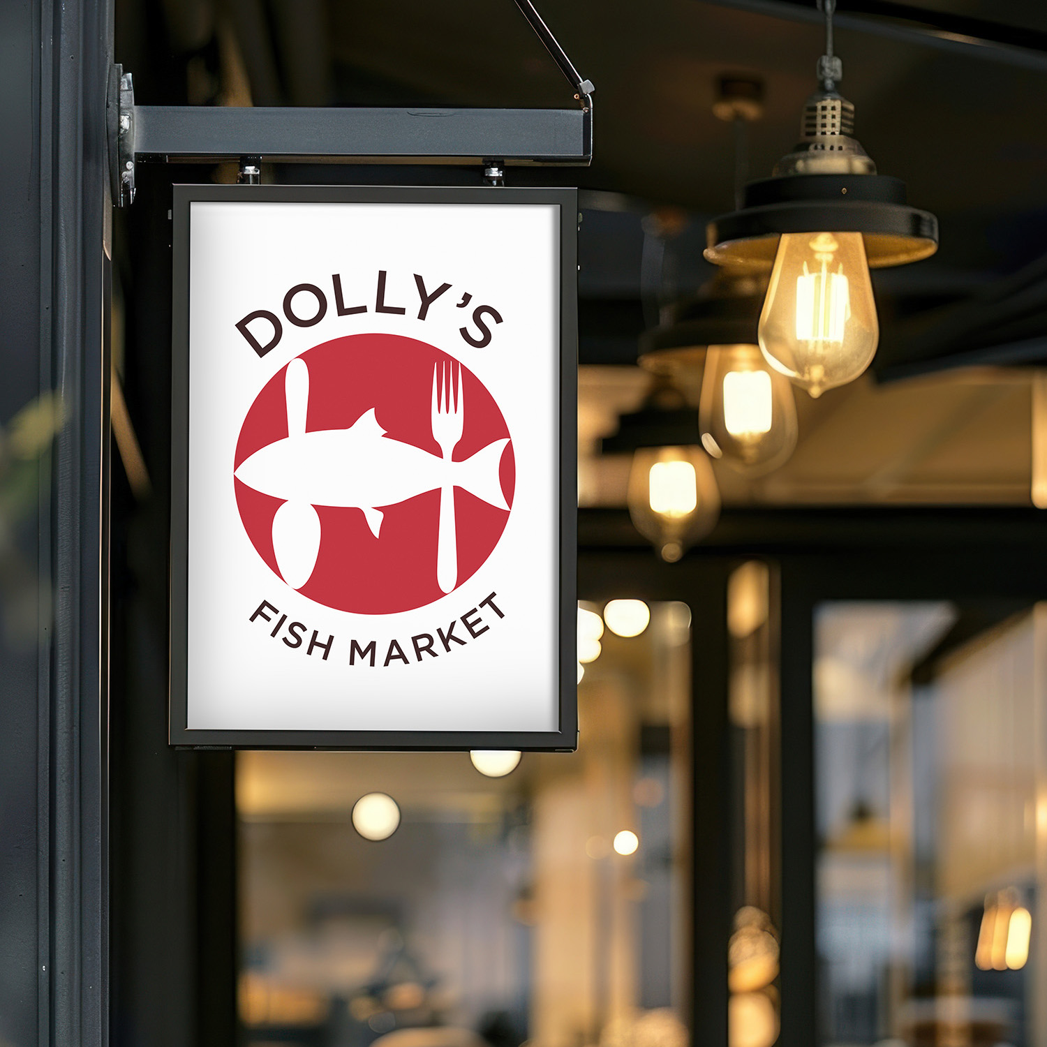
For exterior signage, legibility was a key consideration. The simplified salmon and cutlery mark holds its form at large scale, while the bold typography ensures the Dolly’s name can be read quickly by visitors arriving from the nearby cruise ship dock. This clarity allows the logo to function as both wayfinding and branding — instantly communicating that Dolly’s is not just a market, but a place to sit down and enjoy fresh seafood.