Stone Caddie is a fly box subscription service created to take the confusion out of the tackle shop. The name draws from the stonefly, an essential food source for trout and a popular fly imitation, paired with the idea of a caddie in golf — someone always there to guide and support you. Each box delivers hand-picked flies curated for season, region, and skill level, so anglers can spend less time guessing and more time on the water.
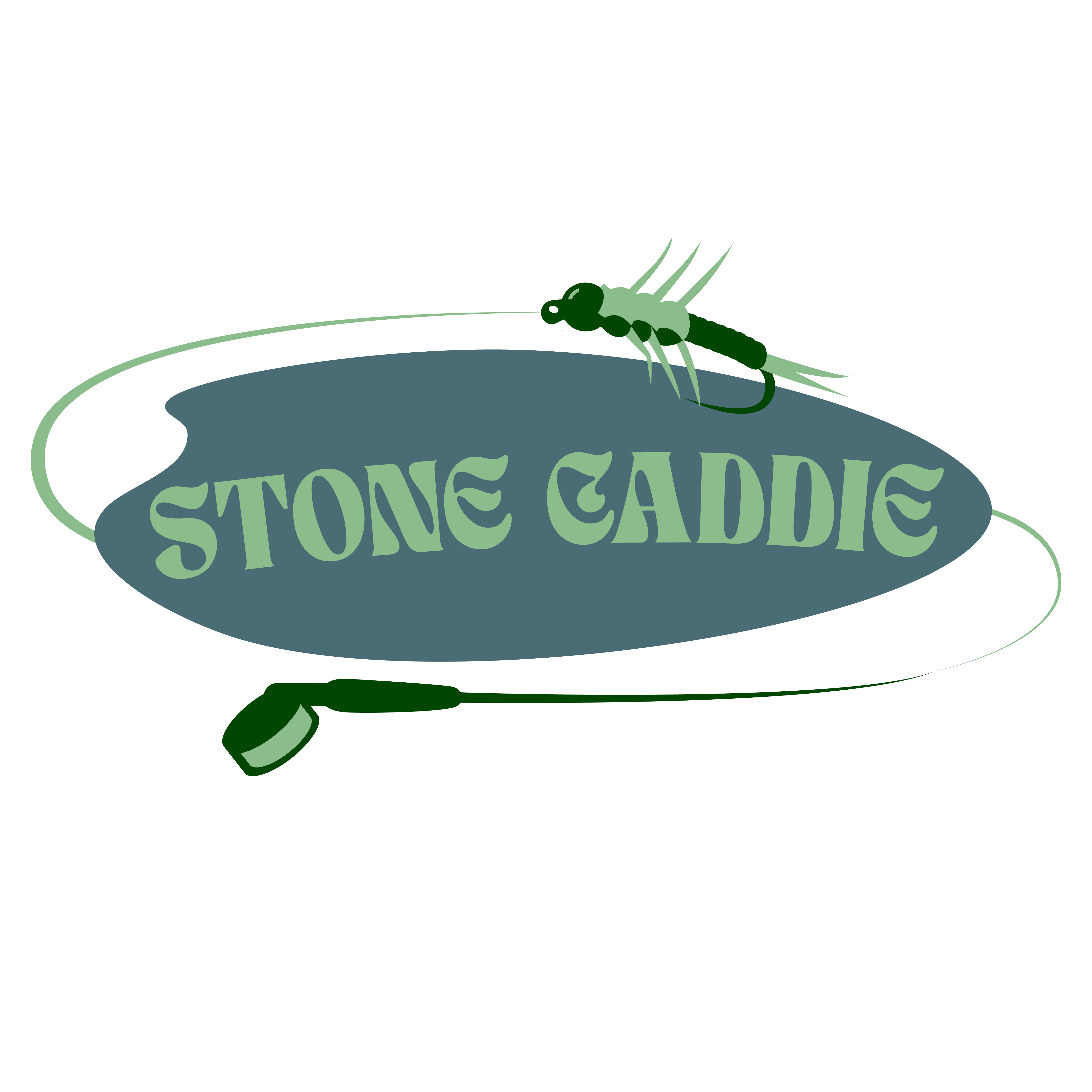
The Stone Caddie logo combines nature and prestige through a fly rod and line that form a subtle “S” around the wordmark. The fishing fly detail is modeled after a stonefly — a vital trout food source and one of the most popular fly imitations — grounding the logo in both the brand’s name and its fly-fishing roots. A deep green palette conveys growth, trust, and quality, while the Tan Nimbus typeface, with its organic curves, echoes the flow of rivers and unifies the identity into a premium yet authentic outdoor brand.
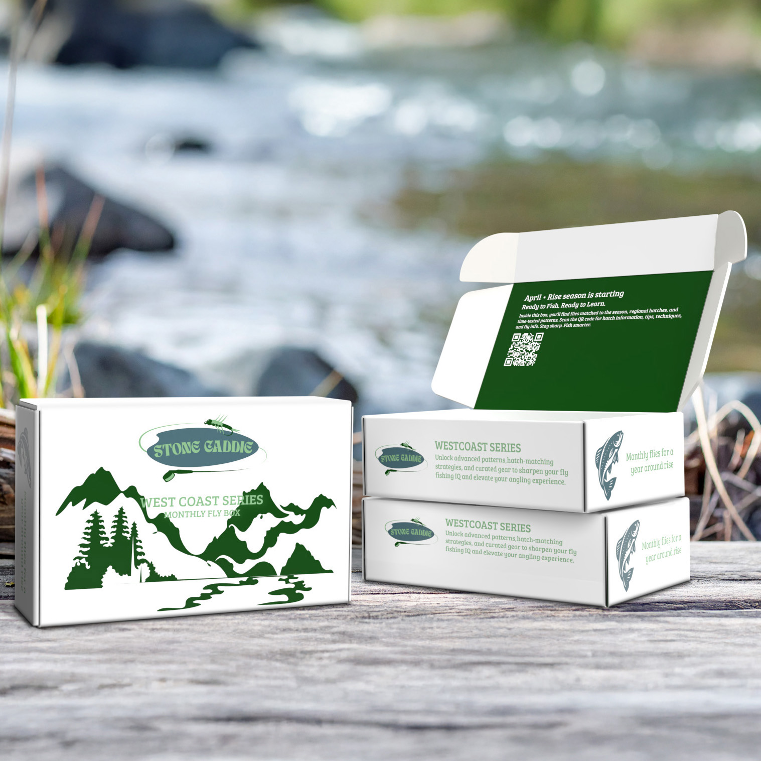
The Stone Caddie packaging connects the brand to the Pacific Northwest through bold graphics of rivers, mountains, and forests, reinforced by the deep green palette of the identity. Inside, a welcoming message, subscription details, and a QR code turn the box into part of the experience, guiding subscribers like a true “caddie” from the moment they open it.
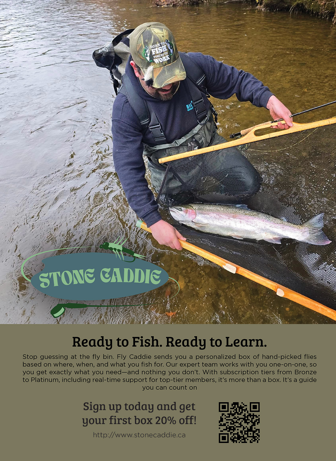
This ad introduces Stone Caddie as both a gear provider and a guide, using authentic on-the-water photography to connect with anglers. The headline “Ready to Fish. Ready to Learn.” emphasizes the brand’s dual promise, while the call-to-action and QR code make signing up immediate and accessible.

Branded collateral like the Stone Caddie University: Knots booklet adds value beyond the product, giving subscribers practical skills to use on the water. By educating as well as outfitting anglers, the brand reinforces its role as a trusted guide and strengthens the “caddie” concept.